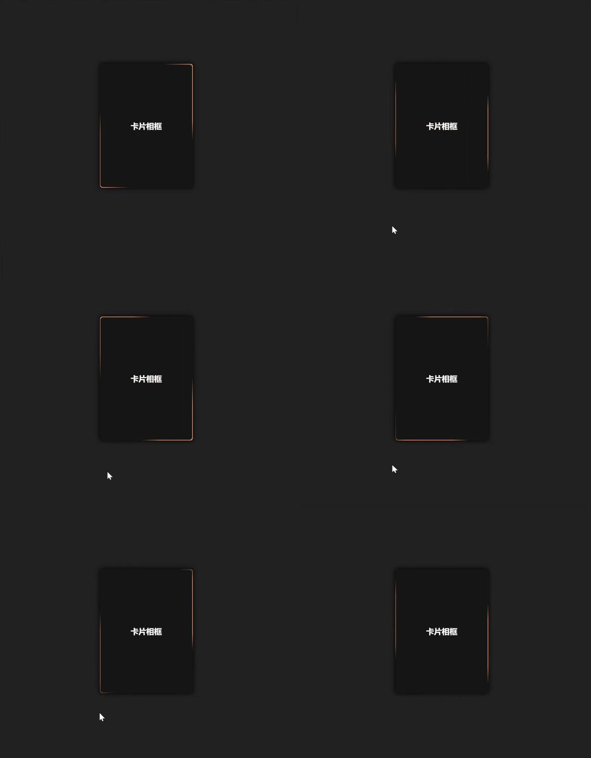
流光卡片相框 可翻转 | 特效源码
简介:还在找不用依赖第三方库的轻量流光翻转卡片代码?这篇文章提供的可翻转流光卡片相框特效源码,用CSS背景动画实现边框流光效果,配合transform属性完成平滑3D翻转,体积小、加载快,支持自定义颜色、流光速度和卡片尺寸,是网页特效开发的实用参考素材
<!DOCTYPE html>
<html lang="zh">
<head>
<meta charset="UTF-8">
<meta name="viewport" content="width=device-width, initial-scale=1.0">
<title></title>
</head>
<style>
body{background-color:#212121;}
.card{overflow:visible;width:190px;height:254px;margin:300px auto;}
.content{width:100%;height:100%;transform-style:preserve-3d;transition:transform 300ms;box-shadow:0px 0px 10px 1px #000000ee;border-radius:5px;}
.front,.back{background-color:#151515;position:absolute;width:100%;height:100%;backface-visibility:hidden;-webkit-backface-visibility:hidden;border-radius:5px;overflow:hidden;}
.back{width:100%;height:100%;justify-content:center;display:flex;align-items:center;overflow:hidden;}
.back::before{position:absolute;content:' ';display:block;width:160px;height:160%;background:linear-gradient(90deg,transparent,#ff9966,#ff9966,#ff9966,#ff9966,transparent);animation:rotation_481 5000ms infinite linear;}
.back-content{position:absolute;width:99%;height:99%;background-color:#151515;border-radius:5px;color:white;display:flex;flex-direction:column;justify-content:center;align-items:center;gap:30px;}
.card:hover .content{transform:rotateY(180deg);}
@keyframes rotation_481{
0%{transform:rotateZ(0deg);}
0%{transform:rotateZ(360deg);}
}
.front{transform:rotateY(180deg);color:white;}
.front .front-content{position:absolute;width:100%;height:100%;padding:10px;display:flex;flex-direction:column;justify-content:space-between;}
.front-content .badge{background-color:#00000055;padding:2px 10px;border-radius:10px;backdrop-filter:blur(2px);width:fit-content;}
.description{box-shadow:0px 0px 10px 5px #00000088;width:100%;padding:10px;background-color:#00000099;backdrop-filter:blur(5px);border-radius:5px;}
.title{font-size:11px;max-width:100%;display:flex;justify-content:space-between;}
.title p{width:50%;}
.card-footer{color:#ffffff88;margin-top:5px;font-size:8px;}
.front .img{position:absolute;width:100%;height:100%;object-fit:cover;object-position:center;}
.circle{width:90px;height:90px;border-radius:50%;background-color:#ffbb66;position:relative;filter:blur(15px);animation:floating 2600ms infinite linear;}
#bottom{background-color:#ff8866;left:50px;top:0px;width:150px;height:150px;animation-delay:-800ms;}
#right{background-color:#ff2233;left:160px;top:-80px;width:30px;height:30px;animation-delay:-1800ms;}
@keyframes floating{
0%{transform:translateY(0px);}
50%{transform:translateY(10px);}
100%{transform:translateY(0px);}
}
</style>
<body>
<div class="card">
<div class="content">
<div class="back">
<div class="back-content">
<strong>卡片相框</strong>
</div>
</div>
<div class="front">
<div class="img">
<div class="circle">
</div>
<div class="circle" id="right">
</div>
<div class="circle" id="bottom">
</div>
</div>
<div class="front-content">
<small class="badge">标签</small>
<div class="description">
<div class="title">
<p class="title">
<strong>照片名称</strong>
</p>
<svg fill-rule="nonzero" height="15px" width="15px" viewBox="0,0,256,256" xmlns:xlink="http://www.w3.org/1999/xlink" xmlns="http://www.w3.org/2000/svg"><g style="mix-blend-mode: normal" text-anchor="none" font-size="none" font-weight="none" font-family="none" stroke-dashoffset="0" stroke-dasharray="" stroke-miterlimit="10" stroke-linejoin="miter" stroke-linecap="butt" stroke-width="1" stroke="none" fill-rule="nonzero" fill="#20c997"><g transform="scale(8,8)"><path d="M25,27l-9,-6.75l-9,6.75v-23h18z"></path></g></g></svg>
</div>
<p class="card-footer">520 like | 1314 view</p>
</div>
</div>
</div>
</div>
</div>
</body>
<script>
</script>
</html>